Customer Reports
 Click one of the links listed above
to jump to a section on this page.
Click one of the links listed above
to jump to a section on this page.
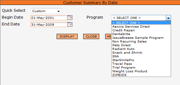
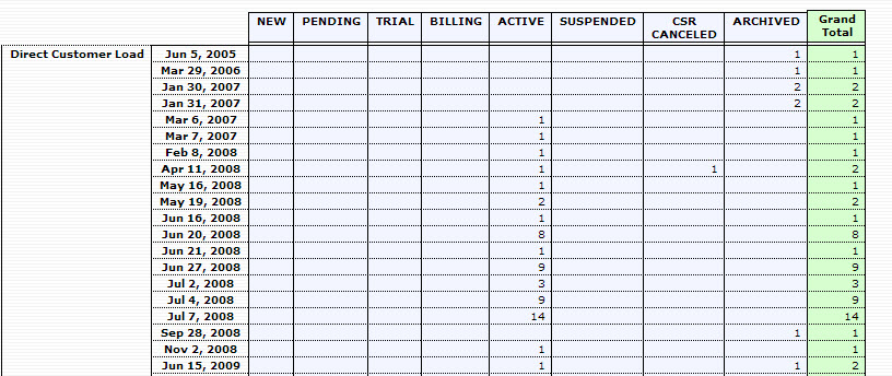
The Customer Summary By Date report will provide a breakout of the current status with corresponding numbers of all customers within the selected date range and program. From the opening screen you can choose your begin and end date range and the selected program, as shown below.
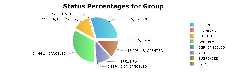
At the top of the Customer Summary By Date report you will see a chart that provides the status percentages of all customers in this program (ie 29.58% of all customers in this program for the dates requested are currently in Active status). An example is seen below.

Below the chart is a number breakout for each day.
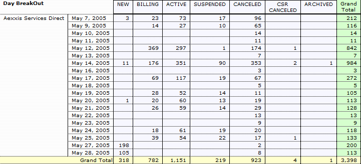
This shows the number of customers acquired on each day, and their current status.
The Customer Summary By Acquisition Group report will show the current status of your customers based on acquisition group center and the acquisition centers within that group. It will help you determine which acquisition centers are performing effectively for your program.
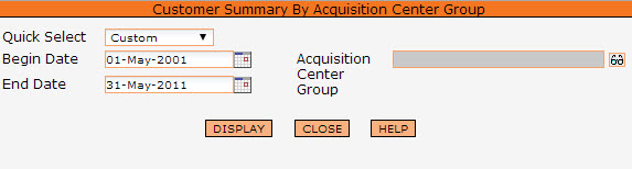
The report is accessed from the Customer tab on the main menu. The first screen allows you to choose the date range for the report of your Acquisition Center group.
At the top of the report you will see a chart with the acquisition center group totals. This will list all your customers, despite the actual acquisition center they are under, as long as that acquisition center is part of the selected group that you ran the report on. The chart will give you totals by percentage of customer status. An example is seen below.
Below the chart is a number breakout for each acquisition center that falls under this acquisition center group.
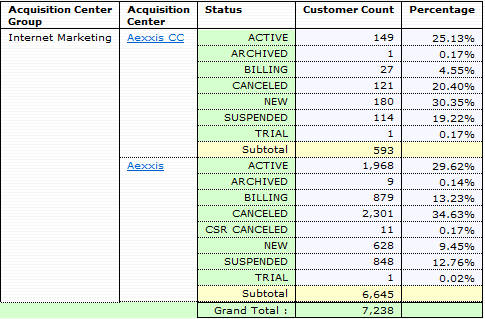
Acquisition Center Group
The name of the acquisition center group
Acquisition Center
The name of each acquisition center
Status
Status of customers in that acquisition center
Customer Count
The count of customers in that status within the acquisition center
Percentage
The percentage of customers within that status
Clicking on each Acquisition Center will link you to the 'Customer Summary By Billing Plan' report. An example can be seen below.
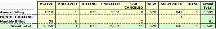
This breakout will show you all customers under the acquisition center that you selected and what billing plan they are under. In addition, it will give you the status of those customers broken down into each billing plan. You can optional view this breakout report graphically using the 'Toggle Data / Graphic' link at the top.
The Customer Summary By API report will list your customers first grouped by the API that they came from, and then by the date that they came though that API. The report is accessed from the Customer tab on the main menu. The first screen allows you to choose the date range for the report and can filter by the Creation Date or Order Date for the Program that you select.
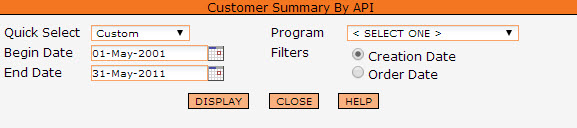
It will help you to get an idea of which API's are performing effectively for your program. An example can be seen below.
Customers are broken down by status to further help you understand what customers are doing that were acquired by each API.
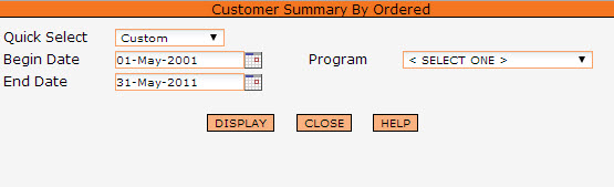
The Customer Summary By Ordered report shows you customers listed by the product that they have ordered. At the top of the report you will see your program totals. This will list all your customers, despite the product that they have ordered. They are listed by their status, and totaled. Also listed is the percentage that the status holds.
The report is accessed from the Customer tab on the main menu. The first screen allows you to choose the date range for the report as well as the program.
Listed below the program totals will be lists of the same information but grouped by the product that was ordered. This will allow you to see how products are performing as far as customers are concerned. It will help you identify which products are performing well and which are not performing well.
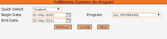
The Summary of Fulfillments report is accessed from the Customer tab on the main menu. The first screen allows you to choose the date range for the Program or Programs want to run the report on.
The Customer Summary of Fulfillments report will show the total fulfillments according to date range you selected.
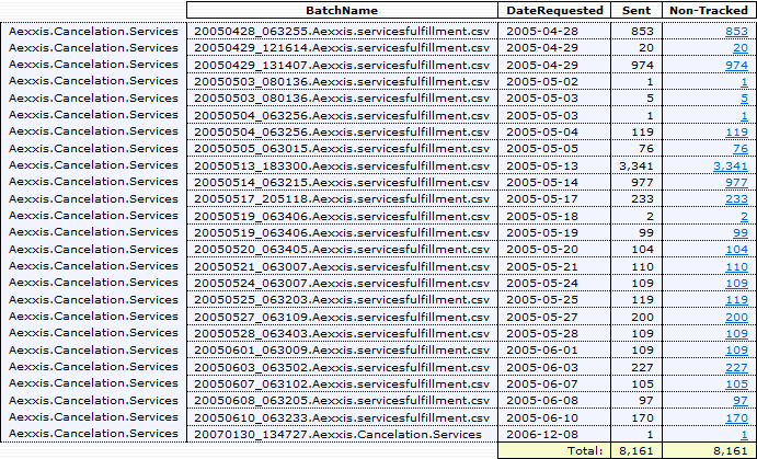
The first step of this report is a summary of all your fulfillments under the specific program and date range you selected. It will show you each fulfillment by name, and list out the number of customers that are under that fulfillment. An example is seen below.
Clicking any of the fulfillment names will give you a detailed report about that specific fulfillment. An example is seen below.
First Column
This is the name of the fulfillment.
Batch Name
This is the name of each batch file generated under this fulfillment.
Date Requested
This is the date the fulfillment ran.
Sent
The number of customers that were issued a fulfillment in this batch.
Non-Tracked
The number of customers that do not have a tracking number filled in from the fulfillment.
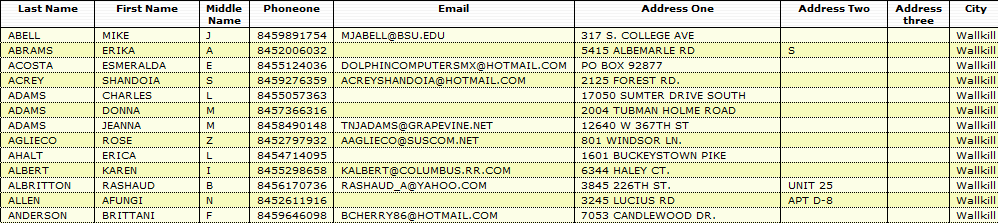
You can optionally click on the 'non-tracked' number to see a detailed listing of customers that do not have a tracking number received back from the fulfillment house. This is sometimes helpful in tracking and contacting customers that were not fulfilled correctly. An example is seen below.
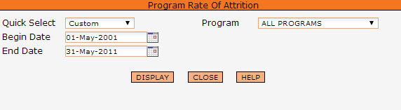
The Customer Program Rate of Attrition report shows the reduction or attrition percentage of loss of customers through each billing cycle of your program. This report is located on the Customer tab from the main menu. Choose your begin and end dates and your program from the first screen and then click on Display.
You will see two graphs displayed: Program Rate of Attrition and Attrition Percentage.
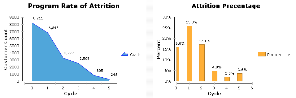
The Program Rate of Attrition graph (in blue) shows the active customers at the start of each billing cycle. The Attrition Percentage graph (in orange) shows the customer percentage of loss in the cycle.
Below the two graphs is the specific number breakdown.
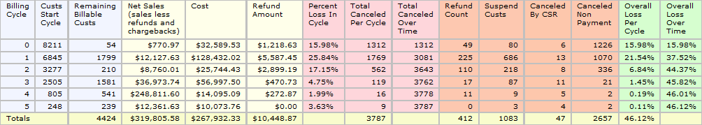
Billing Cycle
The cycle counter (number) on the transaction.
Custs Start Cycle
How many customers started this cycle. (Moved on from the last cycle.)
Remaining Billable Custs
How many customers remain in this cycle. For some reason they have not move on to the next cycle, and they have not canceled. These would be resolvable customers.
Net Sales
The net amount of transactions for customers in this cycle, ie all sales less refunds and chargebacks.
Cost
The total of the cost amount for customers in this cycle. This total is for customers who do not move past this cycle, but who did make it to this cycle. Any customer in this cycle will not have his cost accounted for in any previous cycle. Any customer moving past this cycle will not have his cost included in this cycle.
Refund Amount
The total dollar amount of refunds disbursed in this cycle.
Percent Loss in Cycle
The percent of customers that were lost (canceled for non-payment/canceled by a CSR/suspended) in this cycle.
Total Canceled Per Cycle
The number of customers that were lost in this cycle in relation to the number that started the cycle. (In the case above, in cycle 5, 248 customers started the cycle, 3 customers were suspended, 4 customers were canceled by CSR and 2 customers were canceled due to non payment (totaling 9); therefore 3.63% of customers who started the cycle canceled.)
Total Canceled Over Time
A running total of lost customers in relation to the number that started the cycle.
Refund Count
The number of customers that were given refunds in this cycle. (This number corresponds with the dollar amount in the Refund column.)
Suspended Custs
The number of customers that were suspended in this cycle in relation to the number that started the cycle. (Part of the number in the Total Canceled Per Cycle)
Canceled By CSR
The number of customers that were canceled by a CSR in relation to the number that started the cycle. (Part of the number in the Total Canceled Per Cycle)
Canceled Non Payment
The number of customers that the system automatically canceled due to non-payment in relation to the number that started the cycle. (Part of the number in the Total Canceled Per Cycle)
Overall Loss Per Cycle
The percent of customers that were lost in relation to the total customers shown. (All customers regardless of cycle).
Overall Loss Over Time
A running total of the percent of customers lost in relation to the total who started. (In the case above, this number ends at 46.12%. This is all 3787 customers who were lost, in comparison to the 8211 that started. The other 53.88% of the customers are in the 'Remaining Billable Custs')
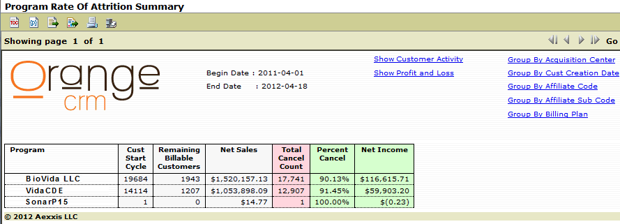
Several variations of this report exist based on the group you select. The program rate of attrition report was created to show all sub affiliates under ONE specific affiliate. For example, you can show them grouped according to acquisition center, customer creation date, affiliate code, affiliate sub code or billing plan. To see these reports, click the link at the top, as shown below.
The Customer Activity report is accessed from the Customer tab on the main menu bar. The Begin and End dates limit the information to the specified date range. The program selection box further limits the information to the specific program. You can also limit the information to a specific acquisition center group. (Note: Selection of an acquisition group filter will only filter acquisition centers that are under this program.) The Beginning Day of Week will allow you to change what day your business week starts. For example, some businesses like to have information from Wednesday to Tuesday. Setting the beginning day of week to Wednesday will group the weeks correctly.

The report starts with two charts at the top. The first, Customer Activity, is seen below.

This chart will show you customer activity as percentages of created customers versus canceled customers. In other words, during the week selected, what percentage of my customers canceled, and what percentage were created. In the example above of the active customers in week one, 1.05% were created that week, and 0.38% canceled. In week two, of all active customers during that week, 3.09% were created, while 0.65% of all active customers that week canceled. This information can be seen below in the 'Canceled %' and 'Created %' columns of the number breakout.

The chart breaks up time periods into weeks. This is where your week beginning parameter comes into play. Changing this parameter will change the week starting dates.
Active During
The total number of customers that were in active status during that week.
Created During
The number of customers that were created in that week.
Created %
The percentage of total active customers that were created that week (or percentage of growth during that time period).
Canceled During
The number of customers that canceled in that week.
Canceled %
The percentage of total active customers that canceled in that wee (or percentage of loss during that time period).
Overall Net
This figure shows the change to the total active customer base in that time period.
The second chart is the Customer Growth chart and an example can been seen below.

The customer growth chart shows the overall growth and loss of active customers over the selected date range. In this example, customers increased from 83,500 at the beginning of February to just under 91,000 during the week beginning February 21. Customer growth then leveled off for the last week of the month, showing a slight loss.
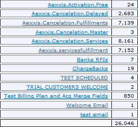
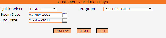
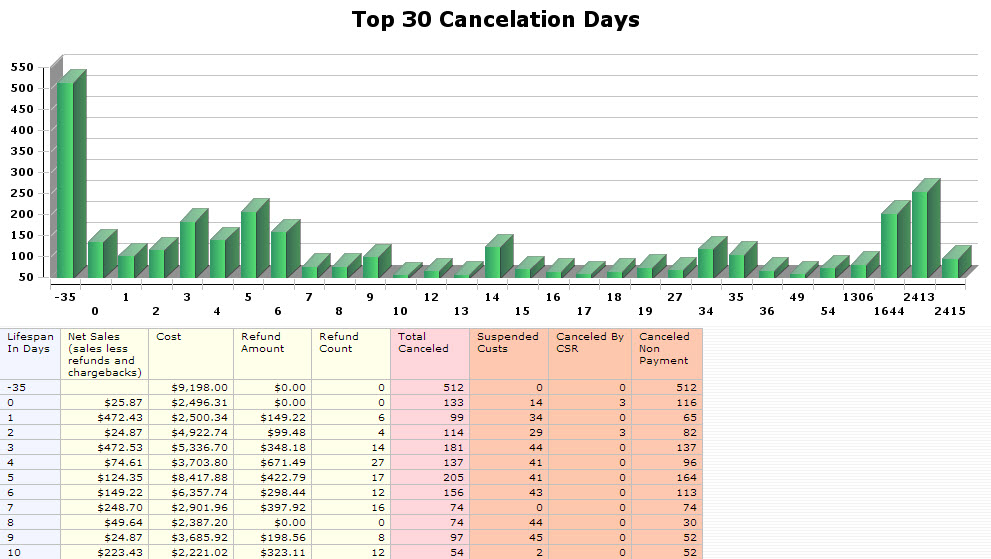
The Customer Cancelation report has been designed to analyze the customer cancelation by days. The report is accessed from the Customer tab on the main menu. The first screen allows you to choose the date range for the report as well as the program or "All Programs".
A report similar to the one below will be displayed.
The CSR Customer Contact Tracking report will allow you to track customers according to the predefined comments that have been attached to the customer. This will allow you to analyze the activity of your CSRs, as well as report on customer activity. It is dynamic according to the type of comment you make. Please see comments to see how to type label a predefined comment.
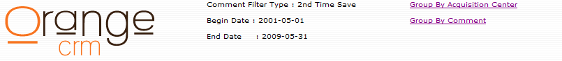
The report is accessed from the Customer tab on the main menu. The first screen allows you to choose the date range for a selected Report Group as well as the Category.
![]()
This report can, for example, show you which customer sales are being saved by your CSRs and which are not. By making a predefined comment, and then putting it into a "Saved Sale" type, whenever a CSR saves a sale, they would attach that predefined comment to the customer. When this report is then run and you select "Saved Sales" from the Report Group, you will be able to see how many customers were saved and the percentage saved grouped by each CSR.
The report first shows the totals for all CSRs, and then divides up the individual representative's actions. This will allow you to analyze your CSRs' performance. An example can be seen below.
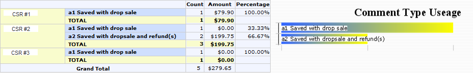
This report can be grouped by the CSR's name, the acquisition center, or the comment. Links to each grouping can be found at the top of the report, as noted below.
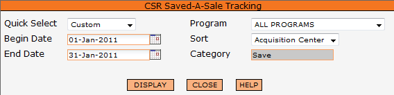
The CSR Save-A-Sale Tracking report has been designed to help managers track the individual save-a-sale results of their customer service representatives. This report is accessed from the Customer tab on the main menu. As noted on the screen below, you can specify the date range for this report, as well as choose the program or all programs and sort by acquisition center or customer service rep (from the drop down). The category is already set to "save".
A similar report shown below will be displayed.
![]()
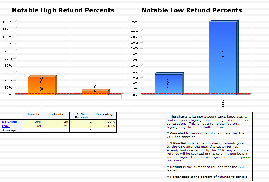
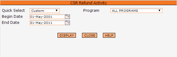
The CSR Refund Activity report has been designed to analyze the cancellation and refund activity of your customer service representatives. The report is accessed from the Customer tab on the main menu. The first screen allows you to choose the date range for the report as well as the program or "All Programs".
The first report that will be displayed, will show two graphs, "Notable High Refund Percents" and "Notable Low Refund Percents", and the data table below showing your programs divided as per the groups defined. (For more information on setting up groups, please see Performance Groups.) Clicking on one of the groups, will drill down into the report showing the individual CSRs included in that group. Again, you will see the two graphs for notable high refunds and notable low refunds and the data table highlighting the number of cancels, refunds, 1 plus refunds, and percentage of refunds versus cancels for each sales representative. The charts showing the high and low percentages are based on a median figure of cancel transactions which will eliminate those CSRs who have very little activity.